Summary stats + plots
Lecture 4
Dr. Elijah Meyer
NC State University
ST 295 - Spring 2025
2025-01-16
Checklist
– Did you read the prepare material?
– Have you accepted your GitHub organization invite?
– Do you have access to this page?
> If so, please bookmark it! You will visit this page very often throughout the semester
– (Try it!) Clone your repository for today’s class
  > If you do not see it, please come talk to me.
  > We will demonstrate how to do this as a class as well.
Announcements
– Quiz-1 released today on Moodle at 12:00pm (due Tuesday before class)
> Largly multiple choice
> One attempt
> Located on Moodle
– Homework-1 will come out next week
Announcements
Solutions to last AE is live! See the website.
Warm-up
Read this code as a sentence
library(tidyverse)

mtcars |>
  glimpse()
Warm-up
What are these called? What do these do?
#| echo: false
#| eval: false
#| message: false
Practice
We are going to practice making summary statistics! Clone the AE for today’s class.
New functions
– group_by()
– summarise()
– n()
– mean(); median(); sd() …etc.
In summary
– We use the pipe operator when we are writing a sequence of actions
– group_by() groups our data and allows us to create summary statistics on the grouped data
– summarise() allows us to calculate summary statistics!
What types of plots can we make?
Golden Rule We let the type of variable(s) dictate the appropriate plot
Pick a plot
What plot is appropriate to graph the following scenarios
– One quantitative variable
– One quantitative variable; one categorical variable
– Two quantitative variables
– One categorical variable
– Two categorical variables
– Scatter plot
– Histogram
– Bar plot
– Segmented bar plot
– Box plot
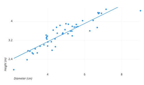
Scatter plot
Two quantitative variables
![]()
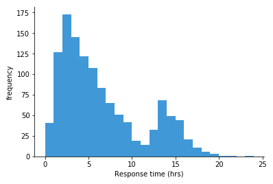
Histogram
One quantitative variable
![]()
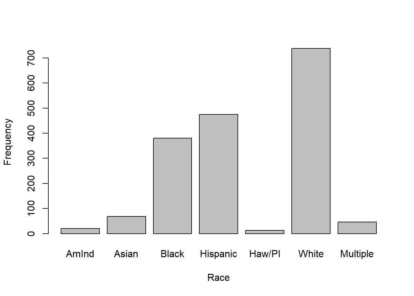
Bar plot
One categorical variable
![]()
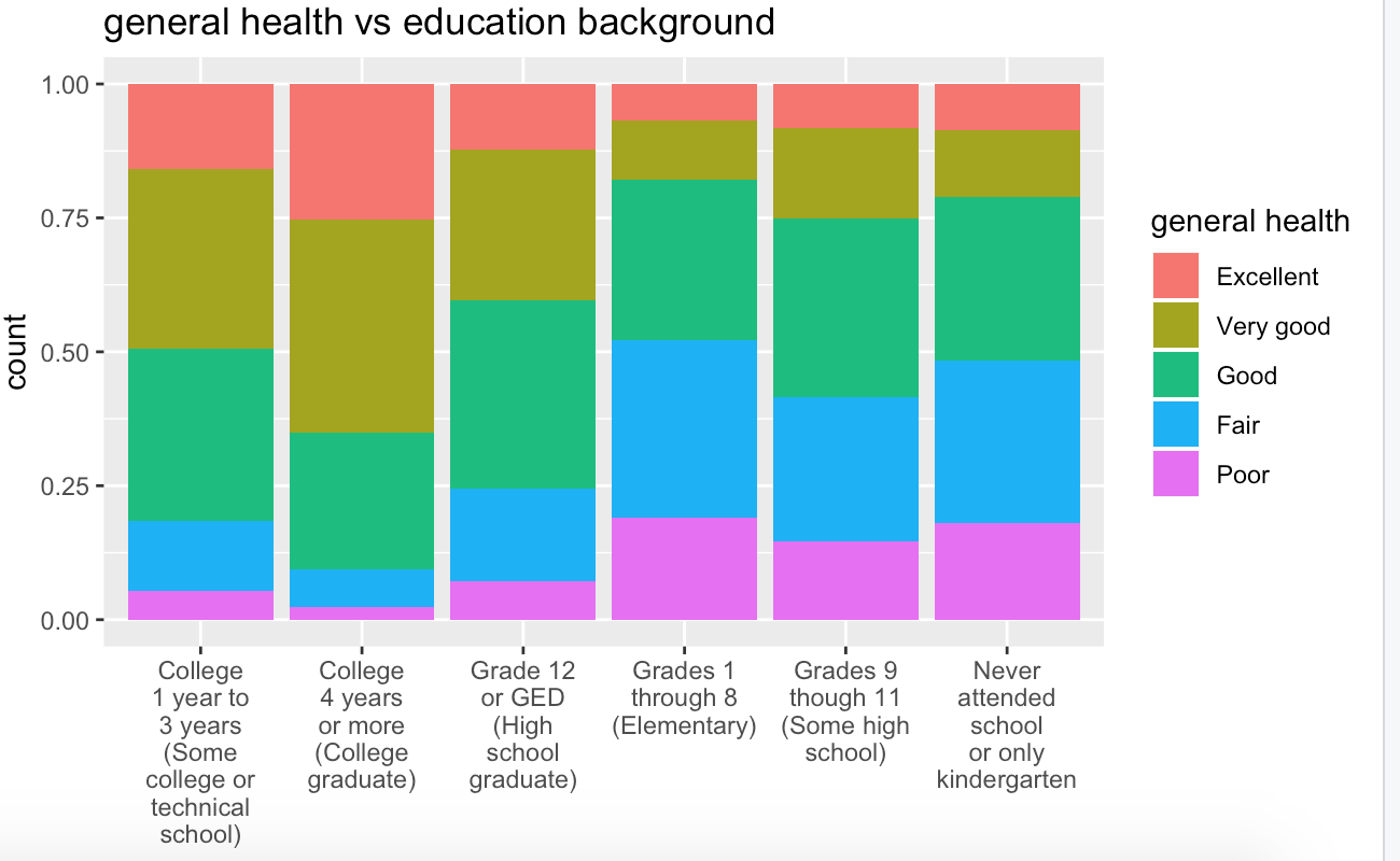
Segmented bar plot
Two categorical variables
![]()
Boxplot
One quantitative; One categorical
![]()
The process
mtcars
You want to create a visualization. The first thing we need to do is set up the canvas…
The process
mtcars |>
ggplot()
The process
mtcars |>
ggplot(
aes(
x = variable.name, y = variable.name)
)
aes: describe how variables in the data are mapped to your canvas
The process
+ “and”
When working with ggplot functions, we will add to our canvus using +
The process
mtcars |>
ggplot(
aes(
x = variable.name, y = variable.name)
) +
geom_point()
Recap of AE
– Construct plots with ggplot().
– Layers of ggplots are separated by +s.
– Aesthetic attributes of a geometries (color, size, transparency, etc.) can be mapped to variables in the data or set by the user.
– Use facet_wrap() when faceting (creating small multiples) by one variable and facet_grid() when faceting by two variables.