Stats + Plots II
Packages
Data
We are going to use the penguins data set in the palmerpenguins Pull up the help file, and read more about the penguins we are going to study!
Let’s remind ourselves the variable names, numbers of rows, etc. that we are working with by taking a glimpse of the data set below.
glimpse(penguins)Rows: 344
Columns: 8
$ species <fct> Adelie, Adelie, Adelie, Adelie, Adelie, Adelie, Adel…
$ island <fct> Torgersen, Torgersen, Torgersen, Torgersen, Torgerse…
$ bill_length_mm <dbl> 39.1, 39.5, 40.3, NA, 36.7, 39.3, 38.9, 39.2, 34.1, …
$ bill_depth_mm <dbl> 18.7, 17.4, 18.0, NA, 19.3, 20.6, 17.8, 19.6, 18.1, …
$ flipper_length_mm <int> 181, 186, 195, NA, 193, 190, 181, 195, 193, 190, 186…
$ body_mass_g <int> 3750, 3800, 3250, NA, 3450, 3650, 3625, 4675, 3475, …
$ sex <fct> male, female, female, NA, female, male, female, male…
$ year <int> 2007, 2007, 2007, 2007, 2007, 2007, 2007, 2007, 2007…Writing in-line code
In-line code is code that can executed in the middle of text that you write!
The syntax uses single backticks (`) followed by the letter r to tell Quarto we are writing R code. This is often useful when using short functions to describe aspects of a data set:
– nrow()
– ncol()
Why would we want to write in-line code?
It’s all about reproducibility!
So how do we do it? See the example below..
The number of rows in the penguins data set is 344! The number of columns in the penguins data set is 8.
Arguments
Using the penguins data set, calculate the mean bill length for EACH of the three species of penguins.
# A tibble: 3 × 2
  species   mean_bill
  <fct>         <dbl>
1 Adelie         38.8
2 Chinstrap      48.8
3 Gentoo         47.5
# na.rm is an argument that strips the na values from the mean functionWhat happened? Why do you think this happened? How can we fix it?
We can override the na.rm argument to strip NA values from the calculation
Let’s open up the help file for summarise, and see if there is an argument within the summarise function we can alter! Then, change your code above.
Can we manipulate that calculation? For example, can we add, subtract, multiply, or divide the mean of bill length?
ggplot
As a reminder, here is the link for all your geoms!
Histogram
Make a histogram! Set an appropriate binwidth. Hint: you can run names(data.set) in your console if you need a quick reminder on the variable names.
To do this, we are going to use geom_histogram(). Pull up the help file for geom_histogram() to find how to set a binwidth.
penguins |>
  ggplot(
    aes(x = bill_length_mm)
  ) +
  geom_histogram(binwidth = 1)
Warning: Removed 2 rows containing non-finite outside the scale range
(`stat_bin()`).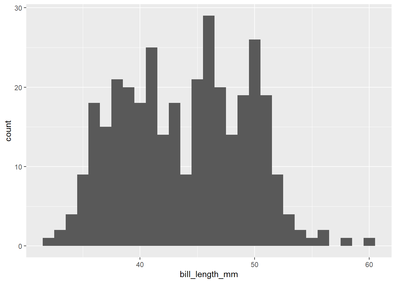
Scatterplot
We are going to create a scatterplot to look at the relationship between a penguin’s weight and flipper length! What geom can we use to make a scatter plot?
geom_point()
penguins |>
  ggplot(
    aes(x = body_mass_g, y = flipper_length_mm,
        shape = species)
  ) +
  geom_point(color = "blue") +
  labs(x = "Body Mass (grams)",
       y = "Flipper Length (mm)",
       shape = "Species",
       title = "This is my title",
       subtitle = "This is my subtitle",
       caption = "Data from palmerpenguins")
Warning: Removed 2 rows containing missing values or values outside the scale range
(`geom_point()`).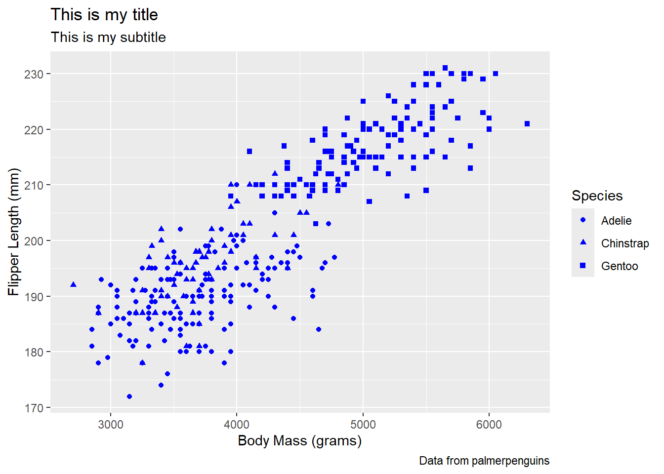
Note: aesthetic is a visual property of one of the objects in your plot. Aesthetic options are:
– shape
– color
– size
– fill
Question: What happens if we put color as an argument in our geom instead of our aes?
We can change non-data aesthetics by putting an argument in the geom instead of the aes function
Labels
Good labels are critical for making your plots accessible to a wider audience. Always ensure the axis and legend labels display the full variable name.
labs() is the function. Common arguments to set are:
– x
– y
– title
– subtitle
– caption
We played with these above in the scatterplot!