Visualizing time series data I
Packages
Warm up
sales <- read_excel("data/sales.xlsx",
                    skip = 3,
                    col_names = c("id" , "n"))
Now, write the code below to recreate the data set seen on the slides.
Hint1: Think about making a new column with a logical indicator
Hint2: We are going to use the function fill() to answer this question. Pull up this help file and think about how this could help us.
sales |>
  mutate(is_brand_name = str_detect(id, "Brand"),
         brand = if_else(is_brand_name, id, NA)) |>
  fill(brand) |>
  filter(!is_brand_name) |>
  select(brand, id, n)
# A tibble: 7 × 3
brand id n
<chr> <chr> <chr>
1 Brand 1 1234 8
2 Brand 1 8721 2
3 Brand 1 1822 3
4 Brand 2 3333 1
5 Brand 2 2156 3
6 Brand 2 3987 6
7 Brand 2 3216 5 Reading in data with dates
Below, we are going to practice reading in date data. Note that data1 and data2 have the year represented by 4 digits. Let’s first read data1.csv in without thinking too much about the data type. Write code below to read the data in as we’ve done before. What type of variable is var1?
data1 <- read_csv("data/data1.csv")Rows: 1 Columns: 1
── Column specification ────────────────────────────────────────────────────────
Delimiter: ","
chr (1): var1
ℹ Use `spec()` to retrieve the full column specification for this data.
ℹ Specify the column types or set `show_col_types = FALSE` to quiet this message.var 1 is a character until we do something about it!
data1
Now, let’s make this a date variable upon reading the data in! In read_csv(), we can specify the column type using col_types = cols(). Let’s read in var1 appropriately.
data1 is in month day year format
# A tibble: 1 × 1
  var1
  <date>
1 1993-03-17
What happens if we mess up the col_types code?
We typically get a NA! But we may get some data where R is guessing. We need to be carful
data3
Now, let’s read in data3.
data3 is in year month day format. Note: The year 1993 is abbreviated to 93
# A tibble: 1 × 1
  var1
  <date>
1 1993-03-17Takeaway: No matter how you specify the date format, it’s always displayed the same way once you get it into R.
Flights
Warning: package 'nycflights13' was built under R version 4.4.2Instead of a single string, sometimes you’ll have the individual components of the date-time spread across multiple columns. This is what we have in the flights data. Let’s show this. Take the flights data set, and select() year, month, day, hour, and minute. We just want to show these variables are in the data set.
flights |>
  select(year, month, day, hour, minute)
# A tibble: 336,776 × 5
year month day hour minute
<int> <int> <int> <dbl> <dbl>
1 2013 1 1 5 15
2 2013 1 1 5 29
3 2013 1 1 5 40
4 2013 1 1 5 45
5 2013 1 1 6 0
6 2013 1 1 5 58
7 2013 1 1 6 0
8 2013 1 1 6 0
9 2013 1 1 6 0
10 2013 1 1 6 0
# ℹ 336,766 more rowsNow, we are going to add to our pipeline from above! We want to create a date/time variable from the existing data. To create a date/time from this sort of input, use make_date() for dates, or make_datetime() for date-times! Below let’s make a departure variable. Before we begin, let’s pull up the help file for make_datetime()
flights_dt <- flights |>
  select(year, month, day, hour, minute) |>
mutate(departure = make_datetime(year, month, day, hour, minute))Note: If you are having trouble with this code, the answer is at the bottom of the document under the Answer section. Run that code so you can continue with the AE!
We have explored many geoms in this course so far. Let’s introduce another one! We are going to use geom_freqpoly() to plot these time series data. Pull up the help file below, and describe this geom.
it’s a lot like geom_histogram, but will create a line instead of bars!
Now, let’s create a frequency plot using geom_freqpoly() only for the day Jan 1st, 2013.
Let’s walk through the code together below.
Note: we can specify a date structure by using ymd, followed by the year, month, day, as one numeric string. This will be useful when filtering!
Note: we tend to use <, >, or functions such as between() when working with complex data structures. Common filtering methods (ex. %in%) do not work with such a complex data structure.
flights_dt |>
  filter(departure < ymd(20130102)) |>
  ggplot(aes(x = departure)) +
geom_freqpoly(binwidth = 600) 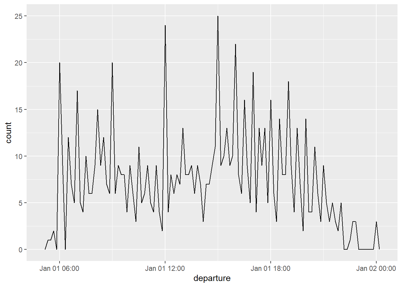
Takeaway: that when you use date-times in a numeric context (like in a histogram), 1 means 1 second, so a binwidth of 86400 means one day.
For dates, 1 means 1 day.
=========================== Answer
flights_dt <- flights |>
  select(year, month, day, hour, minute) |>
  mutate(departure = make_datetime(year, month, day, hour, minute))