Warning: package 'tidytext' was built under R version 4.4.2
Coffee with Friends
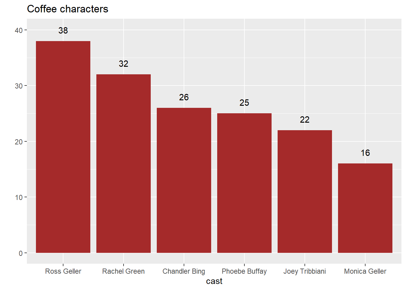
We are going to explore which character loves (said?) coffee the most!
For this, we are going to use the function str_detect(). Specifically, we are going to subset our rows that only have the word coffee in an utterance. Let’s save this as a new R object, friends_coffee.
We are going to narrow the scope of our exploration to just the main 6 characters (so we can continue to practice with fun new functions). Below, you are given a cast R object to use.
At the same time, our goal is to now visualize these data using a bar plot. To start, let’s make a contingency table that counts the number of times each speaker says coffee. Arrange this table in descending order.
Now that we have our table, let’s subset the rows to only contain speakers that are in the values of our cast object. Note: We can subset our rows by more than one string as long as they are separated by a |. Let’s go through a clever way to do this. Run the following code:
It’s good practice to put the bars in descending order, and we see that the bars didn’t take to the table order we gave it…. There are again many ways to accomplish this. Let’s do this by using fct_infreq(). Pull up the help file, and alter your following code above so the bars are in descending order.
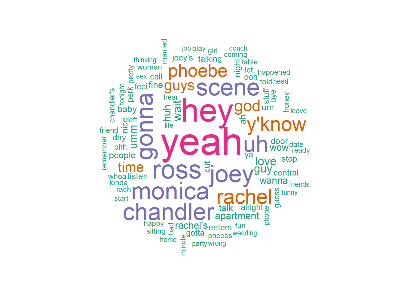
Word Clouds
To make word clouds, we are going to need to install tidytext and wordcloud. We did that above!
Thought exercise: What is a word cloud? What do we think the data should look like in order to make a word cloud plot?
It appears difficult to try and count up frequencies of text when there are sentences for each value. The data would be easier to work with if the words were separate.
And we can start doing that by using unnest_tokens()! Comment out the code below.
# A tibble: 1,149 × 2
   word        lexicon
   <chr>       <chr>
 1 a           SMART
 2 a's         SMART
 3 able        SMART
 4 about       SMART
 5 above       SMART
 6 according   SMART
 7 accordingly SMART
 8 across      SMART
 9 actually    SMART
10 after       SMART
11 afterwards  SMART
12 again       SMART
13 against     SMART
14 ain't       SMART
15 all         SMART
16 allow       SMART
17 allows      SMART
18 almost      SMART
19 alone       SMART
20 along       SMART
21 already     SMART
22 also        SMART
23 although    SMART
24 always      SMART
25 am          SMART
26 among       SMART
27 amongst     SMART
28 an          SMART
29 and         SMART
30 another     SMART
# ℹ 1,119 more rows
We don’t want “stop words” to be in our plot.
Make a contingency table using count() to display how many times words appear
Remove all rows from tidy that match with stop_words (hint: think about how we have put two data sets together in the past)
Note: The answer is at the bottom of the document!
Let’s build a word cloud using the function wordcloud(). Comment through the code below.
wordcloud(clean_words$word, # the words on the plot freq =clean_words$n, # the freq which = size min.freq =300, # min number of times a word needs to be said random.order =FALSE, rot.per =.3, # % of words rotated colors =brewer.pal(4, "Dark2"))# color pallet (unique color and colors used)
geom_text() can be a really useful geom to enhance data visualizations. You used geom_text() on your take-home exam. How could we use geom_text() to enhance the bar plot created above?
We could make the plot be more precise by having the values on top of the bars!We did this above.
Let’s pull up the help file for geom_text() and scroll down to the aesthetics.