HW 1 - Summary Stats + Data visualization
Solutions
This homework is due Monday, Jan 27 at 11:59pm.
Getting started
Go to the st295 organization on GitHub. Click on the repo with the prefix
hw1. It contains the starter documents you need to complete the homework assignment.Clone the repo and start a new project in RStudio (just like we do in class!).
Workflow + formatting
Make sure to
- Update author name on your document.
- Practice your GitHub routine (make at least 1 commit for each question).
- Use informative labels for plot axes, titles, etc.
- Turn in an organized, well formatted document.
Packages
Tips
Remember that continuing to develop a sound workflow for reproducible data analysis is important as you complete this homework and other assignments in this course. There will be reminders in this assignment for you to Render your document. The last thing you want to do is work an entire assignment before realizing you have an error somewhere that makes it so you can’t compile your document. Render after each completed question.
Exercises
Data 1: Duke Forest houses
Use the duke_forest dataset in the openintro package for Exercises 1 and 2.
For the following two exercises you will work with data on houses that were sold in the Duke Forest neighborhood of Durham, NC in November 2020. The duke_forest dataset comes from the openintro package. You can see a list of the variables on the package website or by running ?duke_forest in your console.
Exercise 1
We are going to first explore the duke_forest dataset by calculating a variety of summary statistics. Calculate the summary statistic associated with each scenario below.
- Create a data frame that displays the mean house price across all categories of bedroom.
# A tibble: 5 × 2
    bed mean_price
  <dbl>      <dbl>
1     2    349250
2     3    491650
3     4    570982.
4     5    707500
5 6 1250000 - Create a data frame that displays the minimum and maximum lot area, in acres. Name your columns
min_lotandmax_lot.
# A tibble: 1 × 2
  min_lot max_lot
    <dbl>   <dbl>
1 0.15 1.47- Create a data frame that gives the number of homes for each combination of cooling system AND number of bathrooms. Name your count column
n_count.
`summarise()` has grouped output by 'cooling'. You can override using the
`.groups` argument.
# A tibble: 12 × 3
# Groups: cooling [2]
cooling bath n_count
<fct> <dbl> <int>
1 other 1 3
2 other 2 9
3 other 2.5 6
4 other 3 22
5 other 4 9
6 other 4.5 1
7 other 5 2
8 other 6 1
9 central 2 9
10 central 3 19
11 central 4 14
12 central 5 3- Copy your code from part c and add it to the code chunk in part d. Use the proper code chunk argument to make sure that the output does not show up in your rendered document. Write appropriate comments within the code chunk explaining what each line of code is doing.
duke_forest |> # and then
  group_by(cooling, bath) |> #group by cooling and bath
  summarise(n_count = n()) # use summarize to calculate stats; #n() gives us count
`summarise()` has grouped output by 'cooling'. You can override using the
`.groups` argument.# A tibble: 12 × 3
# Groups: cooling [2]
cooling bath n_count
<fct> <dbl> <int>
1 other 1 3
2 other 2 9
3 other 2.5 6
4 other 3 22
5 other 4 9
6 other 4.5 1
7 other 5 2
8 other 6 1
9 central 2 9
10 central 3 19
11 central 4 14
12 central 5 3Now is a good time to render, commit (with a descriptive and concise commit message), and push again. Make sure that you commit and push all changed documents and your Git pane is completely empty before proceeding.
Exercise 2
Usually, we expect that within any market, larger houses will have higher prices. We can also expect that there exists a relation between the age of an house and its price. However, in some markets newer houses might be more expensive, while in other markets antique houses will have ‘more character’ than newer ones and have higher prices. In this question, we will explore the relations among age, size and price of houses.
Your family friend ask: “In Duke Forest, do houses that are bigger and more expensive tend to be newer than smaller and cheaper ones?”.
Once again, data visualization skills to the rescue!
- Create a scatter plot to exploring the relationship between
priceandarea, also display information aboutyear_built(that is conditioning foryear_built, or your z variable). - Use
size = 3within the appropriate geom function used to make a scatter plot to make your points bigger. - Layer on
geom_smooth()with the argumentse = FALSEto add a smooth curve fit to the data and color the points byyear_built. - Include informative title, axis, and legend labels.
- Discuss each of the following claims (1-2 sentences per claim). Use elements you observe in your plot as evidence for or against each claim.
- Claim 1: Larger houses are priced higher.
- Claim 2: Bigger and more expensive houses tend to be newer ones than smaller and cheaper ones.
duke_forest |>
  ggplot(
    aes(x = area, y = price , color = year_built)
  ) +
  geom_point(size = 3) +
  geom_smooth(se = F) +
  labs(title = "Area vs Price",
       subtitle = "conditioned on color",
       x = "Area",
       y = "Price",
       color = "Year Built")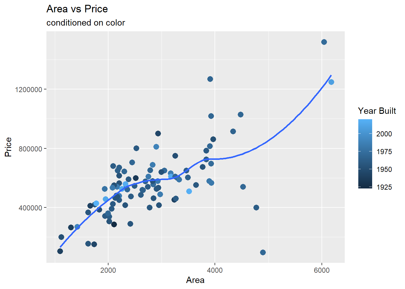
Claim 1: Yes, there seems to be evidence of a positive relationship between the price of the home and the area of the home as suggested by the fitted line that is increasing.
Claim 2: No, there does not seem to be a relationship between the price and age of the home as we don’t observe clusters of points of lighter color (representing newer houses) in the top the plot (where prices are higher).
Data 2: BRFSS
Use this dataset for Exercises 3 through 5.
The Behavioral Risk Factor Surveillance System (BRFSS) is the nation’s premier system of health-related telephone surveys that collect state data about U.S. residents regarding their health-related risk behaviors, chronic health conditions, and use of preventive services. Established in 1984 with 15 states, BRFSS now collects data in all 50 states as well as the District of Columbia and three U.S. territories. BRFSS completes more than 400,000 adult interviews each year, making it the largest continuously conducted health survey system in the world.
Source: cdc.gov/brfss
In the following exercises we will work with data from the 2020 BRFSS survey. The data originally come from here, though we will work with a random sample of responses and a small number of variables from the data provided. These have already been sampled for you and the dataset you’ll use is called brfss.csv.
You will use the read_csv() function to read in your data from your data folder. You can find this code in your starter document.
Now is a good time to render, commit (with a descriptive and concise commit message), and push again. Make sure that you commit and push all changed documents and your Git pane is completely empty before proceeding.
Exercise 3
- How many rows are in the
brfssdataset? - How many columns are in the
brfssdataset?
Include the code and resulting output used to support your answer.
glimpse(brfss)Rows: 2,000
Columns: 4
$ state <chr> NA, "CO", "MN", "VA", "UT", "KS", "UT", "TX", "OR", "OH…
$ general_health <chr> "Fair", "Good", "Very good", "Excellent", "Very good", …
$ smoke_freq <chr> "Not at all", "Some days", "Every day", "Not at all", "…
$ sleep <dbl> 6, 7, 6, 8, 7, 10, 7, 6, 8, 8, 8, 6, 9, 8, 7, 7, 8, 6, …There are 2000 rows and 4 columns.
Now is a good time to render, commit (with a descriptive and concise commit message), and push again. Make sure that you commit and push all changed documents and your Git pane is completely empty before proceeding.
Exercise 4
Do people who smoke more tend to have worse health conditions?
- Use a segmented bar chart to visualize the relationship between smoking (
smoke_freq) and general health (general_health). Putsmoke_freqon the x-axis.- Below is sample code for re-leveling
general_health. Here we first convertgeneral_healthto a factor (how R stores categorical data) and then order the levels from Excellent to Poor. The same is done tosmoke_freq, with the ordering being from Not at all to Every day.
- Below is sample code for re-leveling
- You will add to the existing pipeline (code) to make the segmented bar chart.
brfss |>
  mutate(
    general_health = as.factor(general_health),
    general_health = fct_relevel(general_health, "Excellent", "Very good", "Good", "Fair", "Poor"),
    smoke_freq = as.factor(smoke_freq),
    smoke_freq = fct_relevel(smoke_freq, "Not at all", "Some days", "Every day")
    ) |>
  ggplot(
    aes(x = smoke_freq, fill = general_health)
  ) +
  geom_bar(position = "fill" ) +
  labs(title = "Smoking by Health",
       y = "",
       x = "Smoking Frequency",
       fill = "General Health")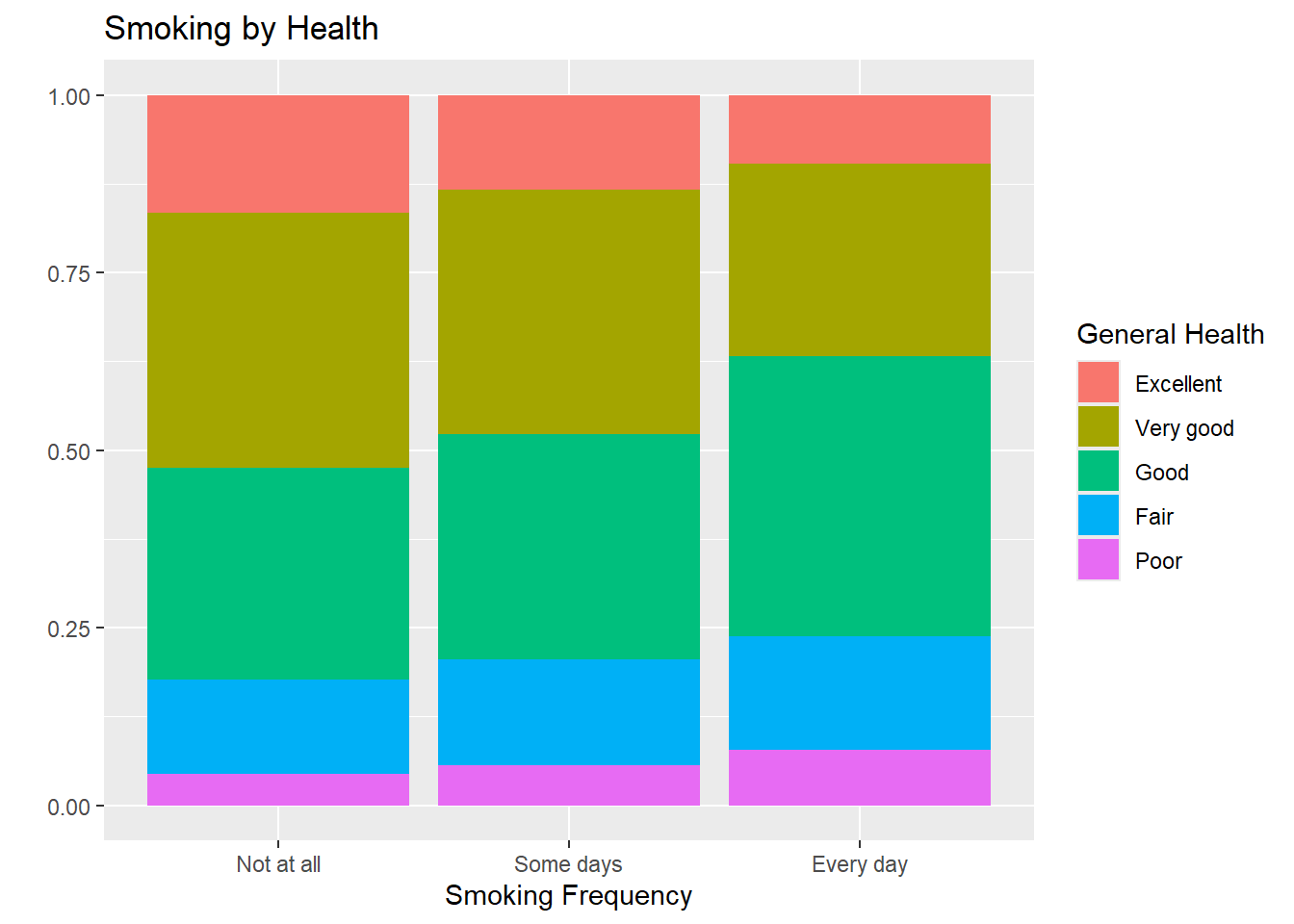
There is some relationship between the health status of individual and their smoking status. Overall, it appears that individuals who don’t smoke at all are more likely to have excellent or very good health compared to those who do.
Now is a good time to render, commit (with a descriptive and concise commit message), and push again. Make sure that you commit and push all changed documents and your Git pane is completely empty before proceeding.
Exercise 5
How are sleep and general health associated?
- Create a visualization displaying the relationship between
sleepandgeneral_health. - Include informative title and axis labels.
- Modify your plot to use a different theme than the default.
- Comment on the motivating question based on evidence from the visualization: How are sleep and general health associated?
brfss |>
  mutate(
    general_health = as.factor(general_health),
    general_health = fct_relevel(general_health, "Poor", "Fair", "Good",
                                 "Very good",  "Excellent")
  ) |>
  ggplot(
    aes(x = general_health, y = sleep)
  ) +
  geom_boxplot() +
  labs(title = "Sleep by Health",
       x = "General Health",
       y = "Sleep") +
  theme_bw()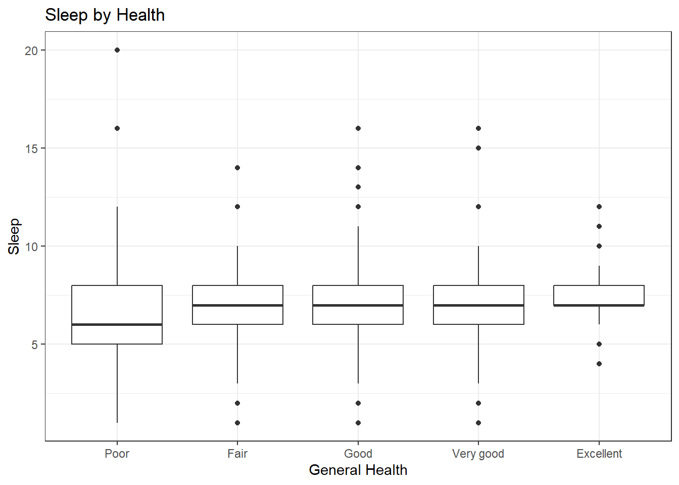
In this sample, there seems to be some relationship between an individual’s general health and how much sleep they get. Those who with poor health tend to get less sleep compared to other health groups. There isn’t much difference between the other groups.
Now is a good time to render, commit (with a descriptive and concise commit message), and push again. Make sure that you commit and push all changed documents and your Git pane is completely empty before proceeding.
Submission
- Go to http://www.gradescope.com
- Click on the assignment, and you’ll be prompted to submit it.
- Mark all the pages associated with exercise. All the pages of your homework should be associated with at least one question (i.e., should be “checked”). If you do not do this, you will be subject to lose points on the assignment.
- Do not select any pages of your PDF submission to be associated with the “Workflow & formatting” question.
Grading
- Exercise 1: 12 points
- Exercise 2: 10 points
- Exercise 3: 4 points
- Exercise 4: 10 points
- Exercise 5: 9 points
- Workflow + formatting: 5 points
- Total: 50 points
The “Workflow & formatting” grade is to assess the reproducible workflow. This includes:
- linking all pages appropriately on Gradescope
- putting your name in the YAML at the top of the document
- Pipes
%>%,|>and ggplot layers+should be followed by a new line - You should be consistent with stylistic choices, e.g.
%>%vs|>