HW 3 - GitHub, Importing, and Time Series
solutions
This homework is due Monday March 24th.
You may not earn more than a 100% on this assignment.
Workflow + formatting
Make sure to
- Update author name on your document.
- Follow the Tidyverse code style guidelines.
- Make at least 3 commits.
- Use informative labels for plot axes, titles, etc.
- Turn in an organized, well formatted document.
Packages
Question 1: GitHub
Suppose you are using GitHub as a collaborative tool, and you see the following merge conflict in your qmd file.
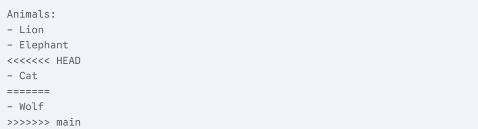
Use this information to answer the following questions below.
- In 2-4 sentences, briefly explain how a merge conflict occurs.
A merge conflict in Git occurs when Git cannot automatically combine changes from different branches because the same lines or files have been modified in conflicting ways. This often happens when you are not working on the most up to date version of your document!
- What was your change to the document? What was your collaborator’s change?
We tried to add Cat, while they tried to add Wolf
- How could the merge conflict be resolved?
This could be resolved by deleting all of the indicators, signaling which change is meant to be kept (or both to be kept).
Question 2: Data import
We’ve used read_csv() many times in this course to read in data. CSV is a comma-separated file i.e. any text file that uses commas as a delimiter to separate the record values for each field. Therefore, to load data from a text file we can use the read_csv() method (or versions of it), even if the file itself does not have a .csv extension.
In the following question, we are going to read in txt data.
- Our first goal is to read in data that looks like this…
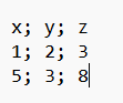
Pull up the help file for ?read_csv(). In 1-2 sentences, explain why we can not use specifically the read_csv() to read in these data.
Next, use a function found in the help file to read in the data. Name the object data and display the output. The output should be a 2 x 3 tibble, with the column names being x, y, and z represented as doubles.
data <- read_csv2("data/data.txt")ℹ Using "','" as decimal and "'.'" as grouping mark. Use `read_delim()` for more control.Rows: 2 Columns: 3
── Column specification ────────────────────────────────────────────────────────
Delimiter: ";"
dbl (3): x, y, z
ℹ Use `spec()` to retrieve the full column specification for this data.
ℹ Specify the column types or set `show_col_types = FALSE` to quiet this message.data# A tibble: 2 × 3
x y z
<dbl> <dbl> <dbl>
1 1 2 3
2 5 3 8- Your fellow co-worker presents you the following data set. Their favorite number is 6, and have used the number 6 as a separator for the values in the data set. For example, the first value of x is 1, and not 16.
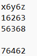
Annoying as this may be, you have the tools to read in the data correctly. In the help file for read_csv(), use the appropriate function to read in the data set. In that function, read in x to be a factor, y to be a double, and z to be a character.
Hint: col_types = "dc"would change the data type of the first column to d representation, and the data type of the second column to be c representation. In the help file for read_csv, read the segment on column types to answer this question.
data2 <- read_delim("data/data2.txt", delim = "6", col_types = "fdc")

data2
# A tibble: 3 × 3
x y z
<fct> <dbl> <chr>
1 1 2 3
2 5 3 8
3 7 4 2 Question 3
This data set describes the minimum daily temperatures over 10 years (1981-1990) in the city Melbourne, Australia.
The units are in degrees Celsius and there are 3650 observations. The source of the data is credited as the Australian Bureau of Meteorology.
Read in the data set using read_csv(). Use the temp data set to recreate the following plot below.
This problem is meant to test both your coding and reasoning skills. Many of the functions used to recreate this plot, we have covered in class. There are a couple that I want to introduce using this problem. These are given in hints. Please read all hints given below for this question.
# A tibble: 10 × 2
    Year mean_temp
   <dbl>     <dbl>
 1  1981      11.5
 2  1982      10.8
 3  1983      11.2
 4  1984      10.6
 5  1985      11.1
 6  1986      10.8
 7  1987      10.9
 8  1988      12.0
 9  1989      11.3
10  1990      11.7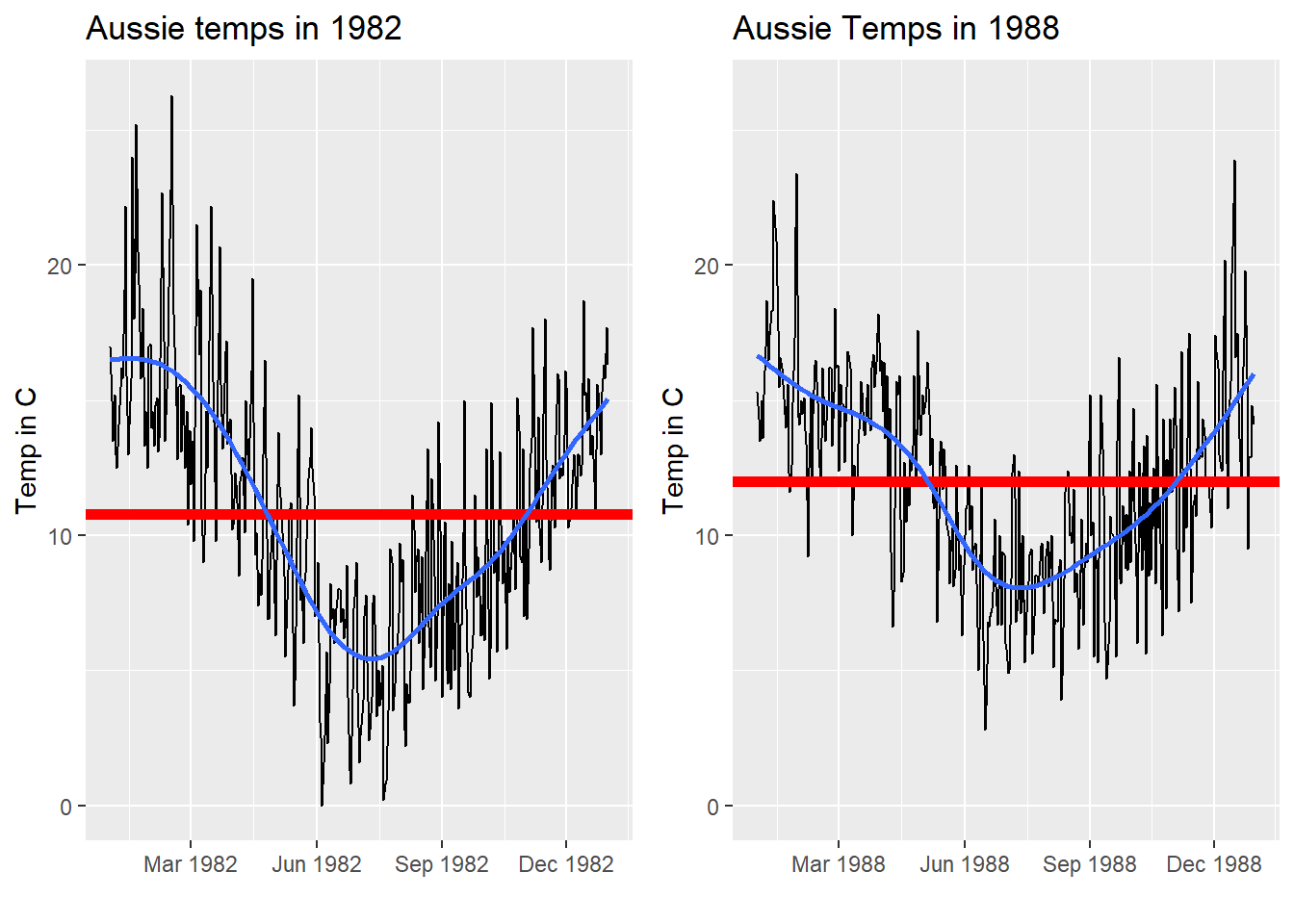
Hint on labels here
Hint: The red line is the mean temperature for that specific year.
Hint: geom_hline() may be helpful to recreate the following plot!
Hint: We have saved data frames as R objects. We can also do this with plots! For example, we can save our plot as the letter a, and call it later. This is really useful for functions like grid.arrange(). Part of recreating this plot involves putting these plots side-by-side. See the resource here on how to use grid.arrange() to put these plots side-by-side!
Hint: In ae-14, we used scale_y_continuous as set limits =. We can also do this using functions like scale_x_date! Just make sure the limits you are setting are being understood correctly (like dates). See how this was done with the filter function in ae-13 solutions.
Question 4
Answers will vary
Please watch the following video on data visualization here .
After you have watched the entire video, please answer the following questions.
- Fill in the blank
aeswith example code on how one might create the plot you see in the video (not including the animation). Note, you may choose your own variables names. The variables names you choose must be informative enough to be equated to what is seen in the video.
Use the correct code chunk to show your code, but not have it run in your rendered document.
hans_rosling_data |>
  ggplot(
    aes(x = income, y = year, fill = region)
  ) +
  geom_point()
Fun fact, if you want to incorporate something like this into your own scatter plots, you can learn about this here .
- You will have a project presentation at the end of this semester and have to present data. Further, communicating data to a general audience is one of the most important skills one can develop. Reflecting on the video, please answer the following questions.
What is one way that Hans Rosling was effective in communicating the story of the data?
What is one strategy you may try and implement during your end of the year presentation? Why?
Grading
| Question | Points |
|---|---|
| Question 1 | 6 |
| Question 2 | 8 |
| Question 3 | 20 |
| Question 4 | 6 |
| W+F | 5 |